Two websites to promote and attract people and businesses to the city of Rotterdam
Information Architecture, Interface and Visual Design — Project at Studio Dumbar, June 2014 – May 2015
Goal
After Studio Dumbar had develop a new visual identity for the Rotterdam city marketing organization ‘Rotterdam Partners’, we were asked to (re)design their two websites. First the website targeted to the travel industry (Rotterdampartners.nl), and subsequently the tourist information website Rotterdam.info.
Result
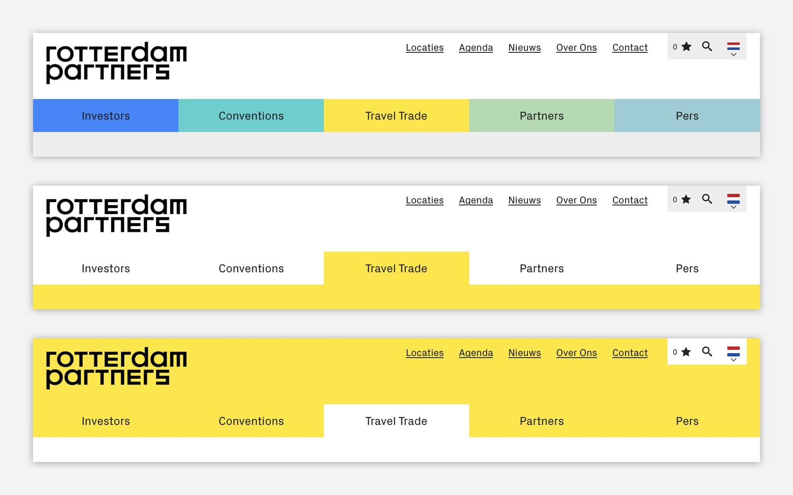
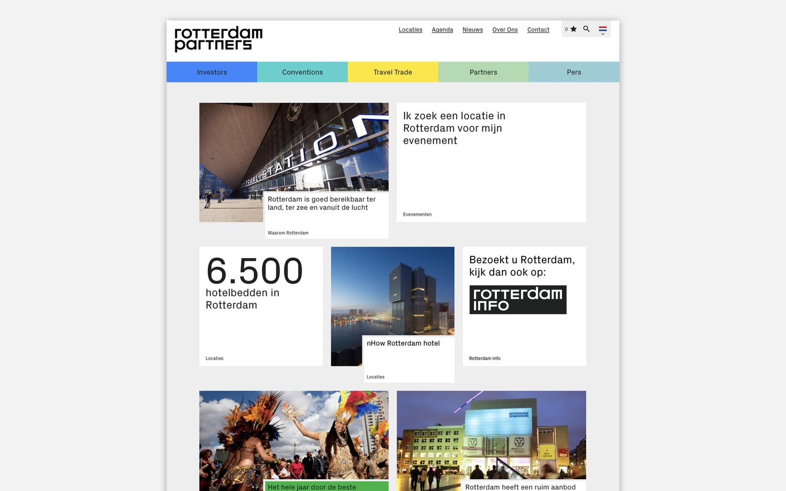
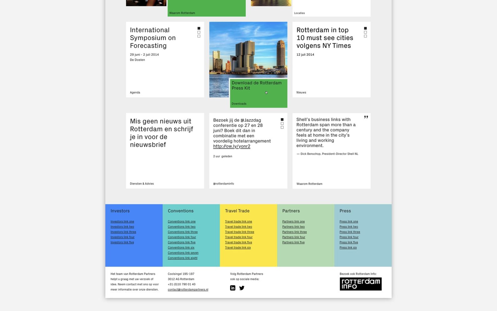
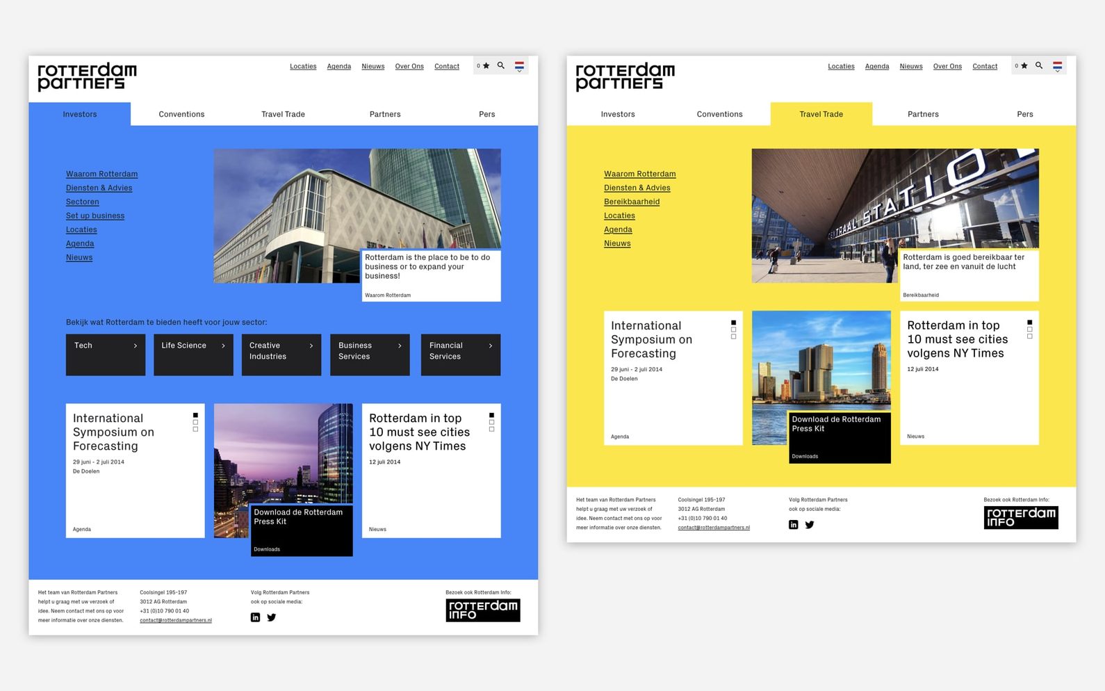
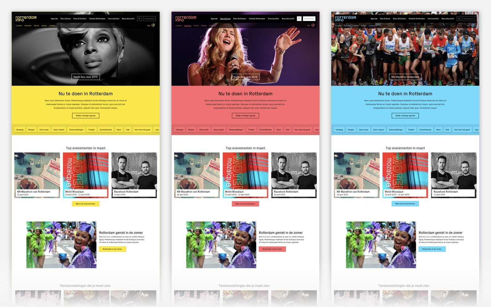
For the travel industry website we utilized the identity’s color(full) palette as a navigational element (aid); every main section got its own color. We used big and bold (building) blocks with strong typography for the display of and entrance to information. Large and bold, just like the city of Rotterdam itself is seen. It also overcame the lack of available imagery, as the content editors signaled they had never time to go after great photos.
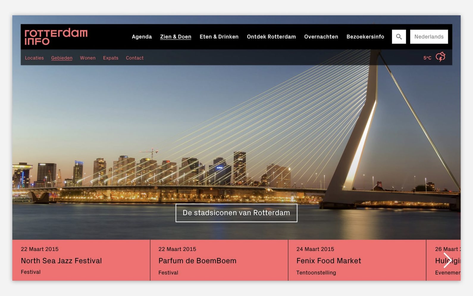
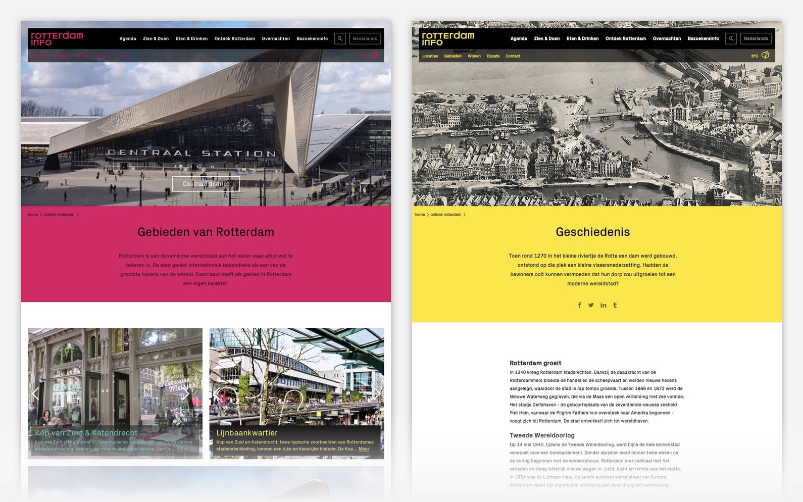
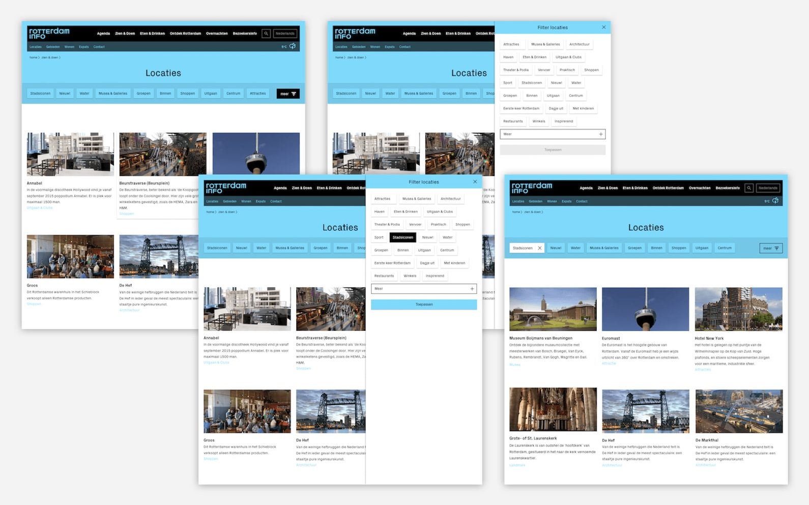
In contrast to the travel industry website, there were many great images of Rotterdam’s attractions and architectural icons (freely) available. It was therefore decided to give beautiful imagery of Rotterdam a prominent place on the tourist information website. To make it easier to browse all the avialble information, and to inspire the user, 5 main thematic landing pages were developed: See & Do, Eat & Drink, Discover Rotterdam, and Stay. An indispensable and easy to filter agenda section was also added.
Role
For both projects, I led 2 or 3 workshops with stakeholders to define the information architecture. I developed wireframes and conducted basic user testing with paper-prototypes. With the brand identity as a starting point, I made the visual designs. For the tourist information site I worked together with and directed a freelance designer working-out templates, components, states, forms, and a grid system.
From the start of the project and many times thereafter, I was in close contact with the front- and back-end developers from another company doing the implementation of both websites. I did a hand-over presentation and reviewed the site a few times during the development process.