Untangling a ‘universe’ of sites for the University of Twente
Information Architecture, Concept, Interface and Visual Design — Project at Studio Dumbar, January 2015 – April 2015
Goal
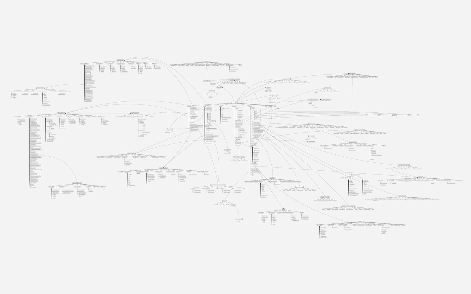
University of Twente (UT) is one of the 3 universities in The Netherlands to offer courses in technology and social sciences. Studio Dumbar had earlier developed an identity for the university, driven by a colourful collection of images — a ‘universe of shapes’ derived from real scientific studies. And two and a half years later, we were asked to re-evaluate, clean-up, and further develop the identity for both print and online applications.
Result
We developed a clear hierarchical and navigational visual system for the huge number of different university websites. This was done in tandem for both online and print — ideas were shared and solutions were aligned between myself and a graphic designer, who was working on tidying up the different visual identity applications.
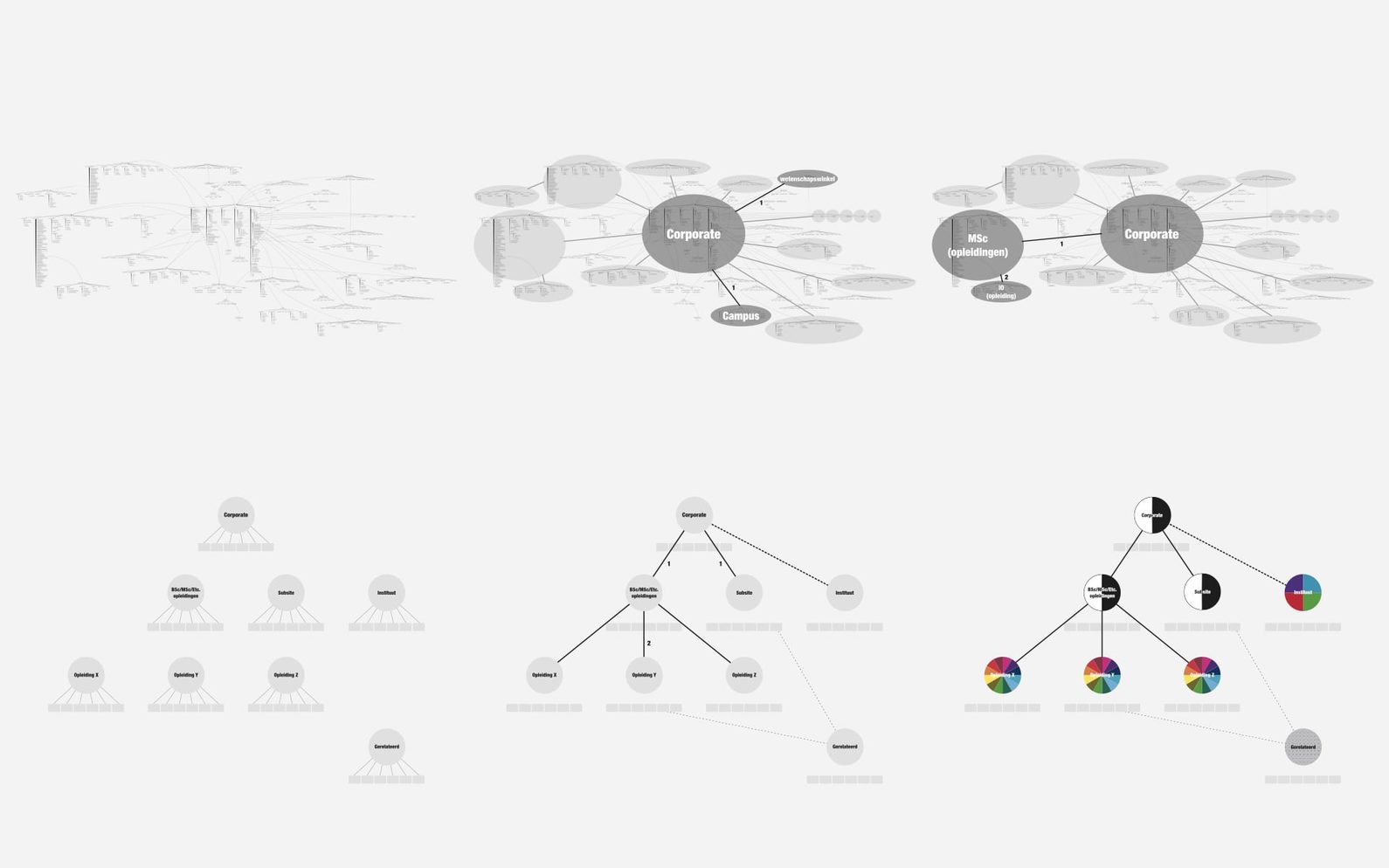
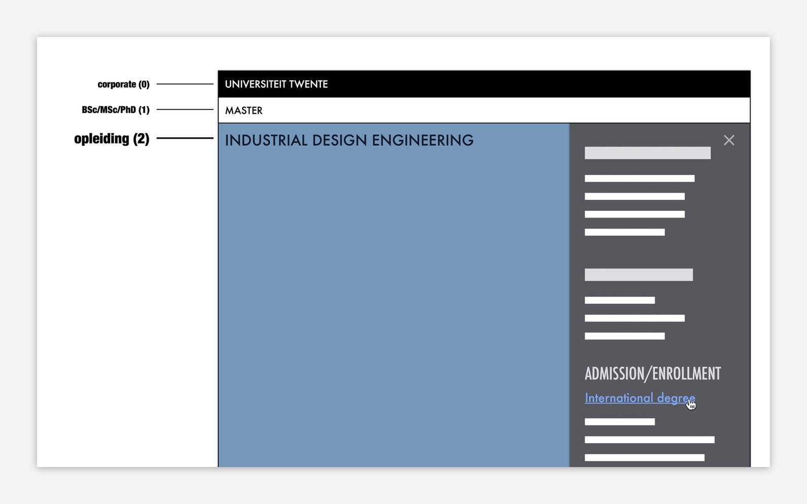
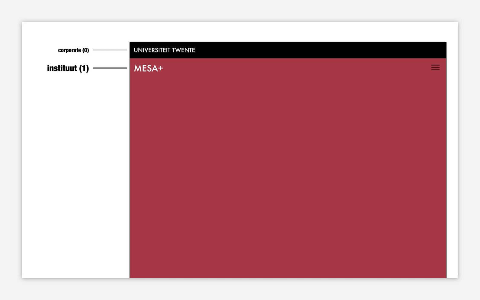
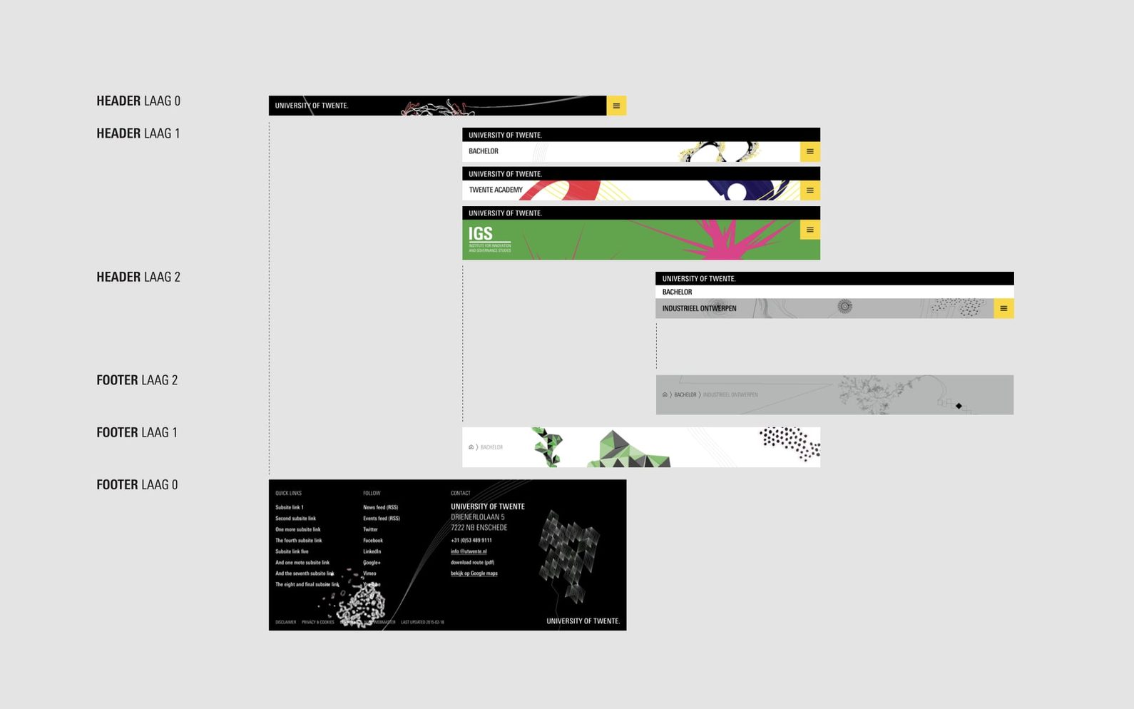
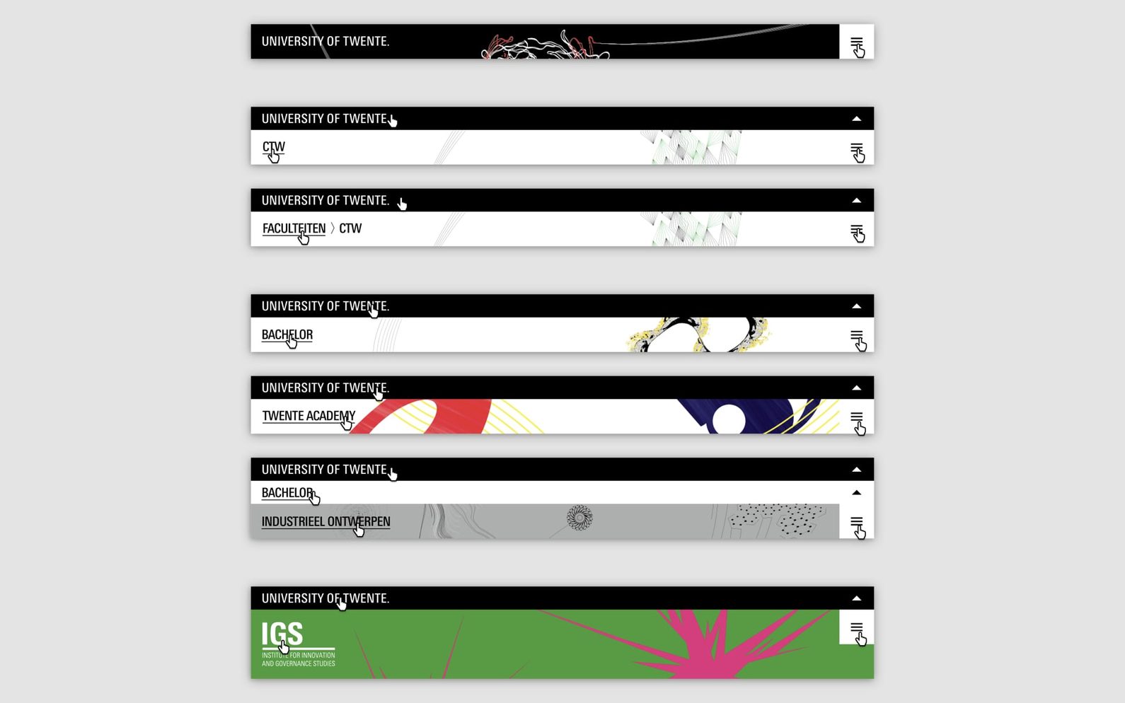
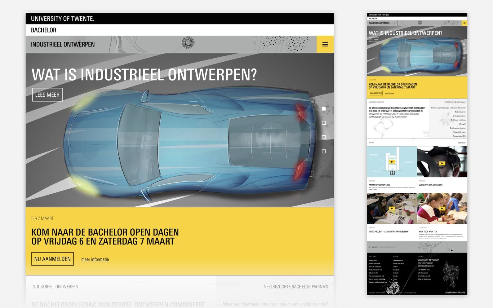
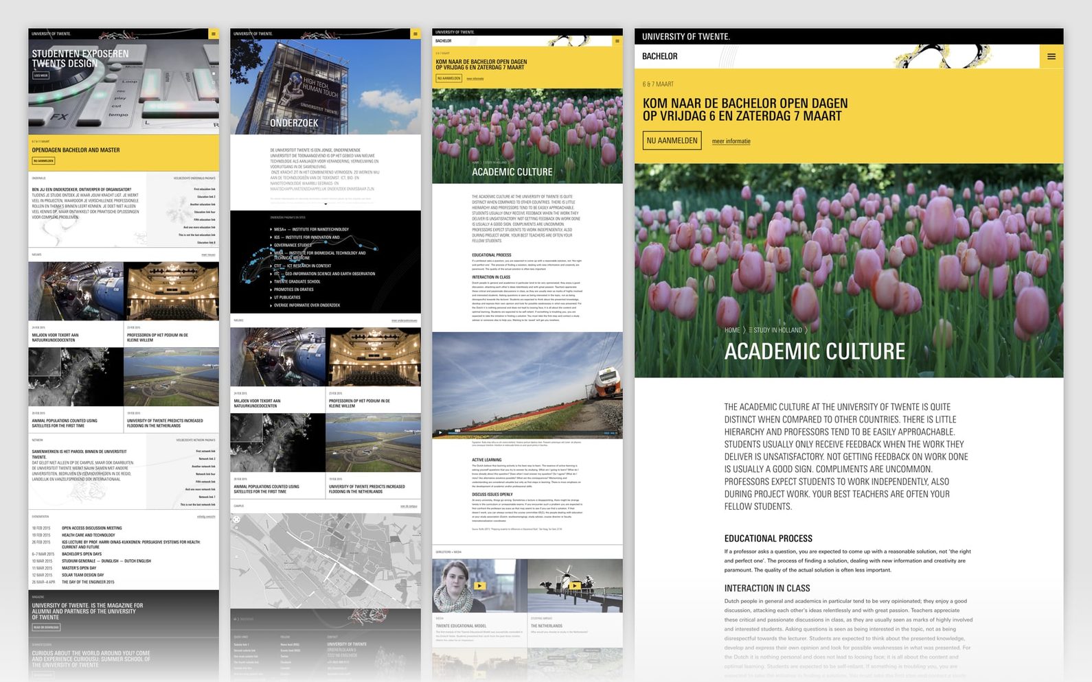
The visual system made the hierarchy (or location) of a university’s site in the huge tree of (related) websites visible. The visual identity already provided distinctive visual elements (the ‘universe of shapes’ imagery) for every level in the hierarchical tree, and those elements were now also given a place online. Resulting in a unison of the university’s various corporate, study, and institute sites under one style.
Role
I was responsible for the interaction design of the navigation concept and the visual design of the brand hierarchy/structure applied to some key pages for inspiration. The project was carried out in close collaboration with a graphic designer, to align decisions made for both print and online.